Exploratory Data Analysis in R
 Photo by Daniel von Appen on Unsplash
EID: REB3566
0. Introduction
Three datasets are combined and explored in this R markdown file. The first dataset contains cancer mortality and incidence by states in the United States. The second dataset has relevant religiosity rankings (number of congregations, number of adherents per 1,000 people) by state. The final dataset lists each state by region (West, Southeast, Southwest, Northeast, and Midwest). The first two datasets were downloaded from data.world. The Regions dataset was constructed by hand from information found on ducksters.com/geography.
I would like to investigate relationships between state/regional religiosity and cancer rates and incidences. I do not expect to find any prominent associations within the data. The datasets neglect dozens (if not hundreds) of potential confounds and biases. If cancer incidence or mortality rates are correlated with religiosity, this is likely because Bible Belt states have more inadequate healthcare than other US regions. Mortality and incidence may differ to some extent by region, but this difference is unlikely to be statistically significant.
Import libraries
# specific data import instructions
library(readr)

# data wrangling
library(tidyverse)

# plotting
library(ggplot2)
library(plotly)
library(GGally)

# for making clustered correlation heatmap
library(prettyR)
library(reshape2)
library(ComplexHeatmap)
library(circlize)


# for Kmeans and PAM Clustering
library(cluster)

# for PCA Biplot
library(factoextra)

# for Pretty Workflows
library(DiagrammeR)
Workflow
I realize that there’s a lot going on with my Project. It’s very figure-heavy, which I know makes it feel more cluttered; I just hope makes it also makes it more informative. I included my workflow to try and clarify my process and to let you know what things to expect and the order to expect them in. It was also a really cool opportunity to use DiagrameR.
grViz("digraph flowchart {
      # node definitions with substituted label text
      node [fontname = Helvetica, shape = rectangle]
      tab1 [label = '@@1']
      tab2 [label = '@@2']
      tab3 [label = '@@3']
      tab4 [label = '@@4']
      tab5 [label = '@@5']
      tab6 [label = '@@6']
      tab7 [label = '@@7']
      tab8 [label = '@@8']
      tab9 [label = '@@9']
      tab10 [label = '@@10']
      tab11 [label = '@@11']
      tab12 [label = '@@12']
      tab13 [label = '@@13']
      tab14 [label = '@@14']
      tab15 [label = '@@15']

      # edge definitions with the node IDs
      tab1 -> tab2 -> tab3 -> tab4 -> tab5 -> tab6 -> tab7 -> tab8;
      tab8 -> tab9;
      tab8 -> tab10 -> tab12 -> tab13;
      tab8 -> tab11 -> tab14 -> tab15;
      tab9 -> tab13;
      tab9 -> tab15
      }

      [1]: 'Import libraries'
      [2]: 'Import All 3 Datasets'
      [3]: 'Join All 3 Datasets'
      [4]: 'Drop Irrelevant Variables from Joined Dataset'
      [5]: 'Summarize Dataset with Summary Stats for Each Variable and GGPairs Plot'
      [6]: 'Visualize Different Variables and the Relationships Between Them'
      [7]: 'Summarize Dataset with Summary Stats for Each Variable and GGPairs Plot'
      [8]: 'Extract Numeric Variables From Dataset'
      [9]: 'Run PCA Only on Numeric Variables'
      [10]: 'Validate Optimal K for Kmeans'
      [11]: 'Validate Optimal K for PAM'
      [12]: 'Perform Kmeans Clustering Using Optimal K'
      [13]: 'Visualize Kmeans Clusters In Feature Space'
      [14]: 'Perform PAM Clustering Using Optimal K'
      [15]: 'Visualize PAM Clusters In Feature Space'
      ")
Import datasets
# read datasets
cancer_states <- read_csv("datasets/cancer_states.csv")
religion_states <- read_csv("datasets/religion_states.csv")
region_states <- read_csv("datasets/region_states.csv")

# dataset dimensions
cancer_states %>% dim
## [1] 50 5religion_states %>% dim## [1] 50 8region_states %>% dim## [1] 50 22. Joining/Merging
Since I have three datasets, I have to perform two joins. I used inner_join() for both because I only want complete cases. NAs were not a problem as the datasets were relatively small, had no missing values, and used the same identifiers for states.
2a. Joining Datasets
# none of the datasets have a colname for the first column; join each dataset by this column
data <- inner_join(cancer_states, religion_states, by = c("X1" = "X1")) %>% inner_join(region_states, by = c("X1" = "X1"))
data %>% glimpse
## Rows: 50
## Columns: 13
## $ X1 <chr> "Alaska", "Alabama", "Arkansa…
## $ mo_Rate <dbl> 173.1, 182.1, 189.6, 146.4, 1…
## $ mo_range_low <dbl> 164.2, 174.5, 174.5, 127.9, 1…
## $ mo_range_high <dbl> 174.4, 199.3, 199.3, 155.3, 1…
## $ in_Rate <dbl> 406.6, 437.9, 456.2, 379.8, 3…
## $ in_range_low <dbl> 369.9, 420.4, 447.0, 369.9, 3…
## $ in_range_high <dbl> 416.5, 445.7, 461.0, 416.5, 4…
## $ total_number_of_congregations <dbl> 1246, 10514, 6697, 4673, 2355…
## $ total_number_of_adherents <dbl> 240833, 3007553, 1614357, 237…
## $ rates_of_adherence_per_1_000_population <dbl> 339.09, 629.23, 553.64, 372.3…
## $ of_adherents <dbl> 0.33909, 0.62923, 0.55364, 0.…
## $ of_adults_who_are_highly_religious <dbl> 0.45, 0.77, 0.70, 0.53, 0.49,…
## $ Region <chr> "West", "Southeast", "Southea…1 and 3: Tidying and Wrangling
I perform data tidying after joining. Here I use pivot functions to make summary statistics more digestible. I use pivot_longer to reformat the summarized output from a single row with ~54 variables (one for each variable and each summary stat) to one with 3 variables (variable, stat, and value) and 54 rows. I pivot wider to give a final table of 8 variables (each numeric variable in the dataset) and 9 rows (each type of summary statistic used).
I also drop mo/in_range_high/low and total number of religious adherence. These first four variables correspond to the mortality and incidence 95% confidence intervals. The dataset contains a rate of adherence variable that makes total adherence obsolete (due to its bias towards more populous states).
3a. Summary Statistics - 6 Core dplyr Functions
# xx_range_high/low are just the 95% CI for the mortality and incidence rates
# total number of adherents is highly dependent on state population; this is dropped because there is a rates of adherence per 1000 people variable
data <- data %>% select(!c(mo_range_low,mo_range_high,in_range_low,in_range_high, total_number_of_adherents))

# use of all 6 core dplyr functions
data %>% group_by(Region) %>% summarize(total_cong = sum(total_number_of_congregations), mean_cong = mean(total_number_of_congregations), sd_cong = sd(total_number_of_congregations)) %>% filter(Region != "West") %>% select(!c(total_cong)) %>% arrange(mean_cong) %>% mutate(plus_one_sd = mean_cong + sd_cong,minus_one_sd = mean_cong - sd_cong )
## `summarise()` ungrouping output (override with `.groups` argument)## # A tibble: 4 x 5
## Region mean_cong sd_cong plus_one_sd minus_one_sd
## <chr> <dbl> <dbl> <dbl> <dbl>
## 1 Northeast 4789. 5276. 10065. -487.
## 2 Midwest 6812. 3957. 10769. 2854.
## 3 Southeast 9608 3683. 13291. 5925.
## 4 Southwest 10506. 11713. 22220. -1207.1a and 3b: Summary Statistics - Summarize
# This is an infinitely wordier way to create the summary tables I love in Python Pandas; every variable gets a full suite of summary statistics
N <- nrow(data)

data %>% summarize_if(is.numeric,list(xxxmean = mean, xxxsd = sd ,  xxxse = function(x) sd(x) / sqrt(N), xxxmin = min,xxxper25 = function(x) quantile(x,0.25), xxxmedian = median,xxxper75 = function(x) quantile(x, 0.75),xxxmax =  max, xxxrange = function(x) max(x) - min(x))) %>% pivot_longer(cols = everything()) %>% separate(name, into = c("variable", "stat"), sep = "_xxx") %>% pivot_wider(names_from = variable, values_from = value)
## # A tibble: 9 x 7
## stat mo_Rate in_Rate total_number_of… rates_of_adhere… of_adherents
## <chr> <dbl> <dbl> <dbl> <dbl> <dbl>
## 1 mean 165. 440. 6886. 483. 0.483
## 2 sd 15.6 31.1 5840. 103. 0.103
## 3 se 2.20 4.39 826. 14.6 0.0146
## 4 min 128. 370. 677 276. 0.276
## 5 per25 155. 417. 2432 400. 0.400
## 6 medi… 164. 446. 5699 507. 0.507
## 7 per75 174. 461. 9406 553. 0.553
## 8 max 199. 514. 27848 791. 0.791
## 9 range 71.4 144. 27171 515. 0.515
## # … with 1 more variable: of_adults_who_are_highly_religious <dbl>data %>% group_by(Region) %>% summarize_if(is.numeric,list(xxxmean = mean, xxxsd = sd , xxxse = function(x) sd(x) / sqrt(N), xxxmin = min,xxxper25 = function(x) quantile(x,0.25), xxxmedian = median,xxxper75 = function(x) quantile(x, 0.75),xxxmax = max, xxxrange = function(x) max(x) - min(x))) %>% pivot_longer(cols = !Region) %>% separate(name, into = c("variable", "stat"), sep = "_xxx") %>% pivot_wider(names_from = variable, values_from = value)## # A tibble: 45 x 8
## Region stat mo_Rate in_Rate total_number_of… rates_of_adhere… of_adherents
## <chr> <chr> <dbl> <dbl> <dbl> <dbl> <dbl>
## 1 Midwe… mean 166. 450. 6812. 526. 0.526
## 2 Midwe… sd 9.85 11.6 3957. 70.5 0.0705
## 3 Midwe… se 1.39 1.65 560. 9.97 0.00997
## 4 Midwe… min 151. 431. 1498 421. 0.421
## 5 Midwe… per25 159. 442. 4302. 480. 0.480
## 6 Midwe… medi… 166. 450. 6016. 537. 0.537
## 7 Midwe… per75 173. 458. 9176 558. 0.558
## 8 Midwe… max 179. 472. 13606 671. 0.671
## 9 Midwe… range 28.6 40.5 12108 250. 0.250
## 10 North… mean 163. 466. 4789. 457. 0.457
## # … with 35 more rows, and 1 more variable:
## # of_adults_who_are_highly_religious <dbl>4. Visualizing
GGPairs, A Hierarchically Clustered Correlation Heatmap, Faceted Boxplot, Violin Plot, and Faceted Scatterplot (Bubbleplot)
4a. GGPairs Plot to View Relationships Between Each Variables
# pairwise summary plots like ggpairs are great for getting a mile-high view of the dataset. They fall apart when you get more than 8 or 9 variables.
data %>% select(!X1) %>% ggpairs(aes(color = as.factor(data$Region)), progress = F)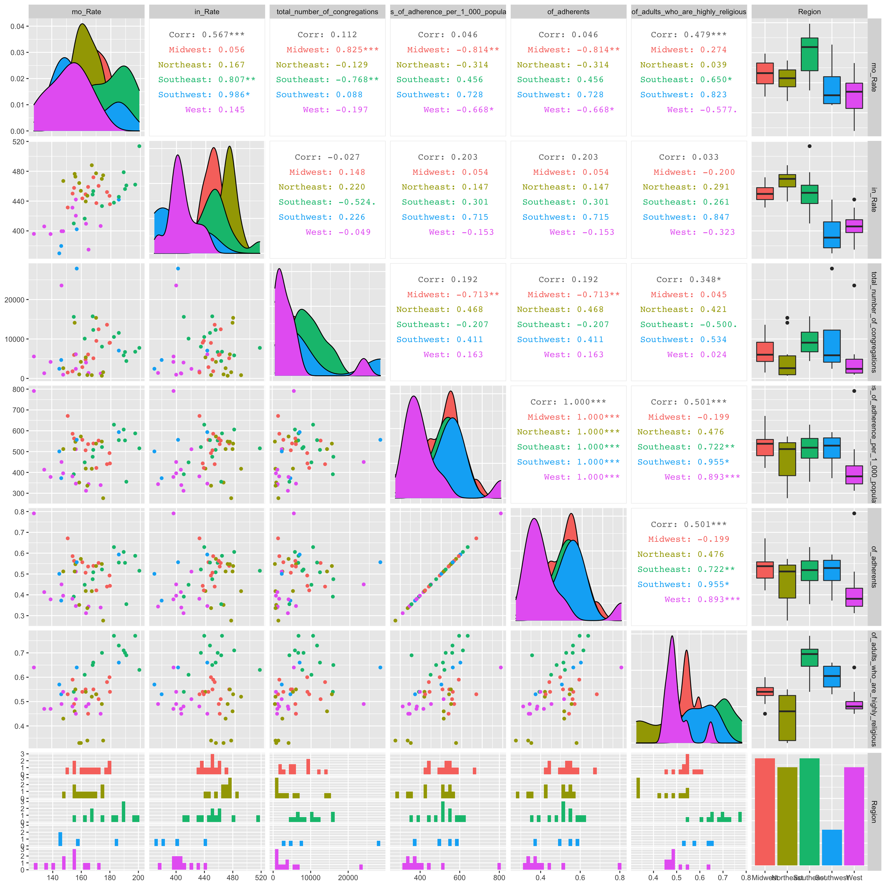 Few significant relationships jump out in the GGPairs plot. There appears to be a significant, strong, and positive correlation between cancer mortality rate and the total number of congregations in the midwest. Also, there seems to be a significant, strong, and negative correlation between cancer mortality rate and adherence rate per 1000 people in the midwest.
4b Hierarchically Clustered Correlation Heatmap
# I personally find correlation geom_tiles hard to read. I found this package called ComplexHeatmap which will Hierarchically cluster the correlation values. This places similar variable combinations together and makes correlations quite a bit easier to assess.

# define color function
col_fun = colorRamp2(c(-1, 0, 1), c("green", "black", "red"))

# generate a clustered heatmap for the correlation matrix
Heatmap(data %>% select_if(is.numeric) %>% cor(use="pair") %>% as.matrix,
        name = "Correlation Matrix of Numeric Variables", #title of legend
        column_title = "", row_title = "",
        row_names_gp = gpar(fontsize = 6),
        column_names_gp = gpar(fontsize = 6),
        col = col_fun) # Text size for row names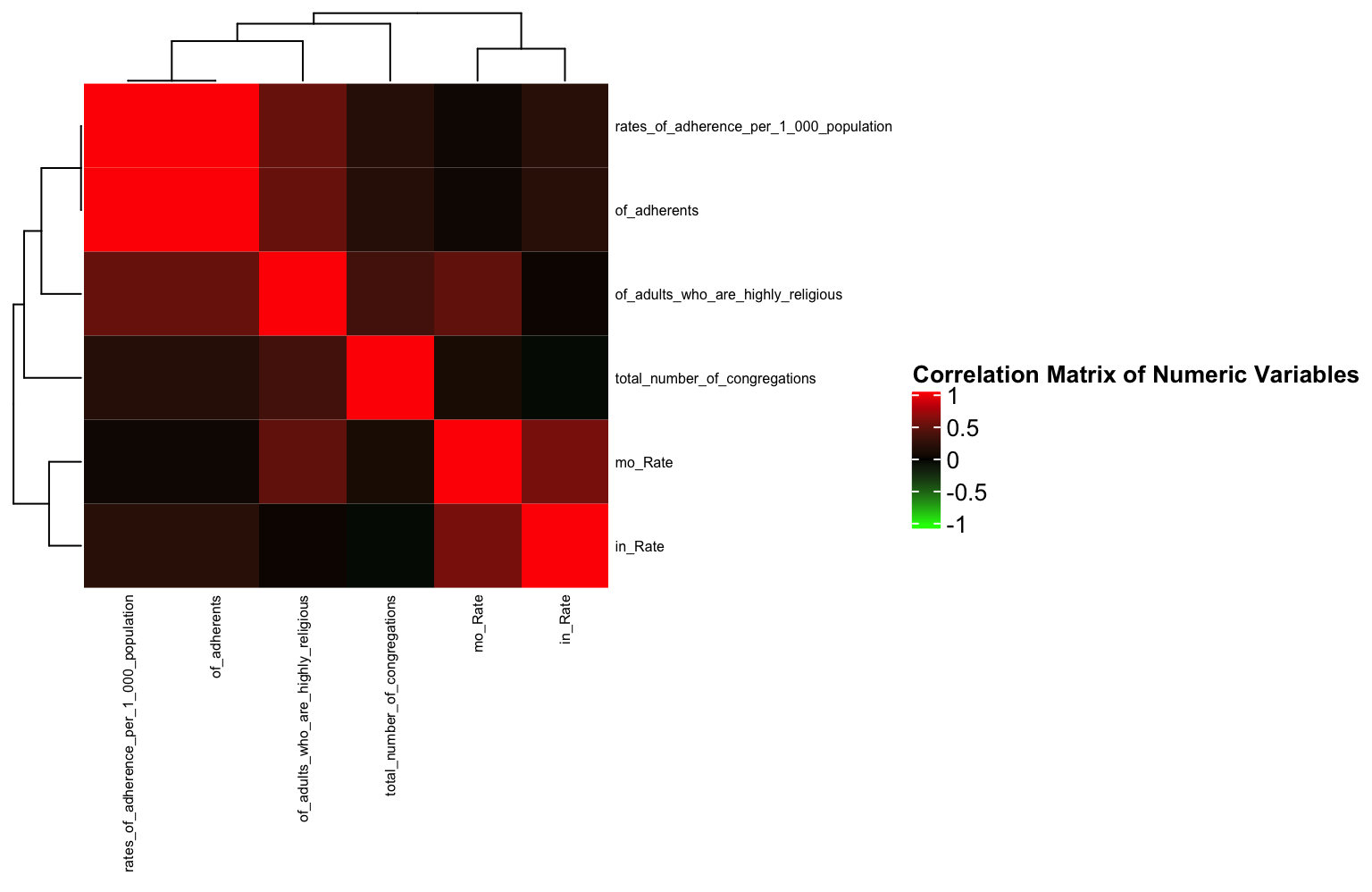
As identified in the ggpairs plot, there are few strong correlations between any variables (save for the variables that are obviously related e.g., of_adherents and rates of adherence per 1000). This will show the same thing as a geom_tile, but here, it’s a little easier to see the relationships between variables since similarly correlated variables are “clustered” closely together.
Interestingly (or maybe not interestingly) the variable correlations cluster based on the dataset from which they originate. This is likely because mortality and incidence often go hand in hand.
4c. Boxplot Using stat=“summary” and facet_wrap
f <- function(x) {
  r <- quantile(x, probs = c(0.10, 0.25, 0.5, 0.75, 0.90))
  names(r) <- c("ymin", "lower", "middle", "upper", "ymax")
  r
}
order <- c("low","moderate","high")
df <- data %>% mutate(mo_rate_f= as.factor(cut(mo_Rate, breaks=c(115,150,170, 250), labels = order,levels=order))) %>% group_by(Region) %>% as.data.frame

df %>% ggplot(aes(Region,total_number_of_congregations)) + geom_boxplot(aes(fill = Region), stat = "summary", fun.data = f, position = position_dodge(1), alpha = 1) + scale_fill_viridis_d() + theme_minimal() + ylab("Total Number of Congregations")+ facet_wrap(~mo_rate_f) + coord_flip() + ggtitle("Total Number of Congregations By Region", subtitle = "Faceted by low, moderate, and high mortality rates")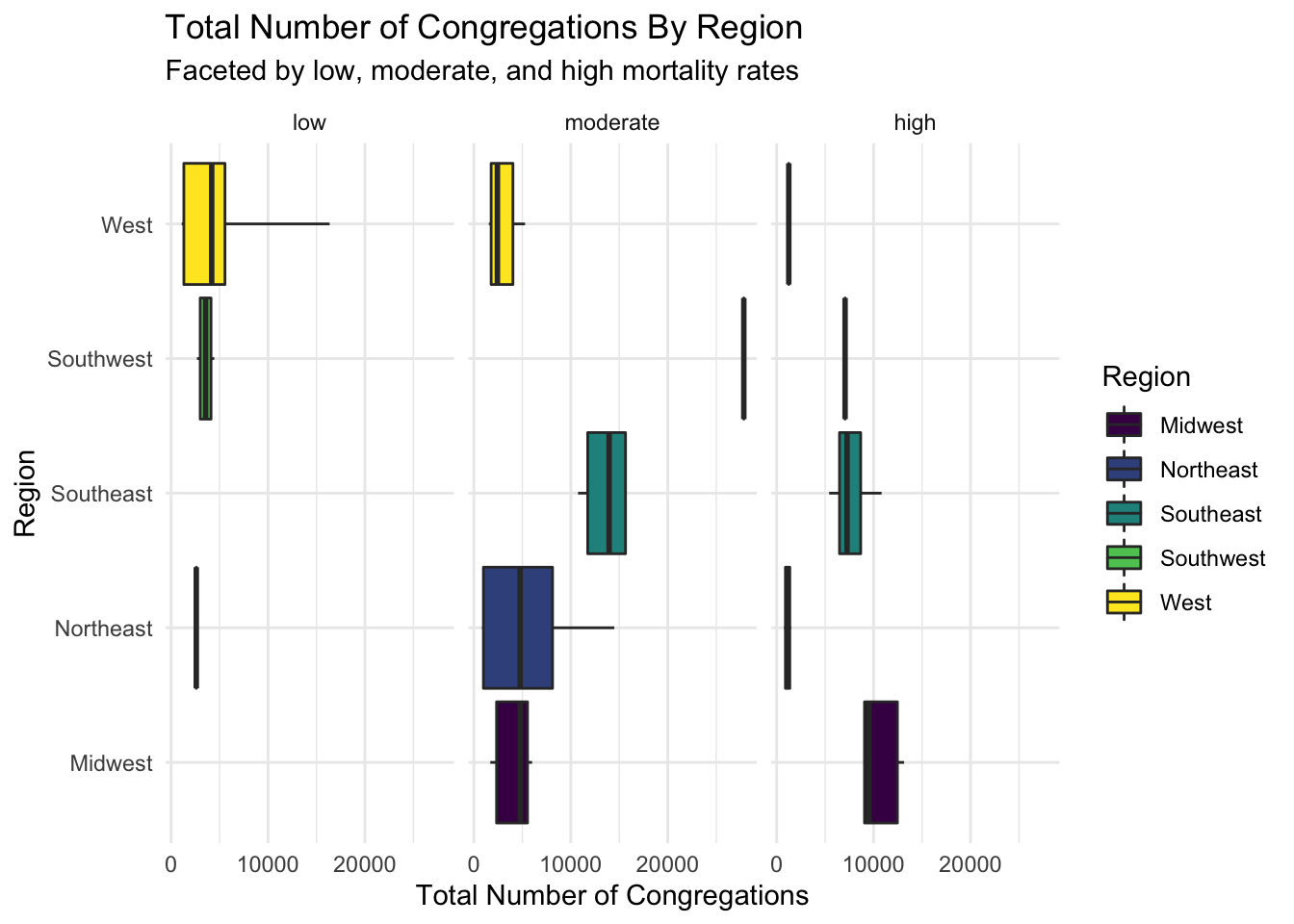
Here are horizontal boxplots comparing the number of congregations by region and low, moderate, high cancer mortality rates. The low number of samples causes some boxplots to spawn as just their median. The only stand-out difference between groups is between the West and Southeast regions in the moderate mortality rate group.
4d. Violin Plot
data %>% ggplot(aes(x=Region, y=in_Rate)) +
  geom_violin(aes(x=Region, y=in_Rate, fill = Region) ,alpha = 0.5,trim = F, draw_quantiles=0:2/2) + geom_jitter(aes(color = rates_of_adherence_per_1_000_population),alpha = 1, size = 3) + scale_color_gradient(low = 'blue', high = 'red')+ theme_minimal() + ylab("Cancer Incidence Rate") + xlab('Region') + ggtitle("Cancer Incidence by Region") + scale_fill_viridis_d()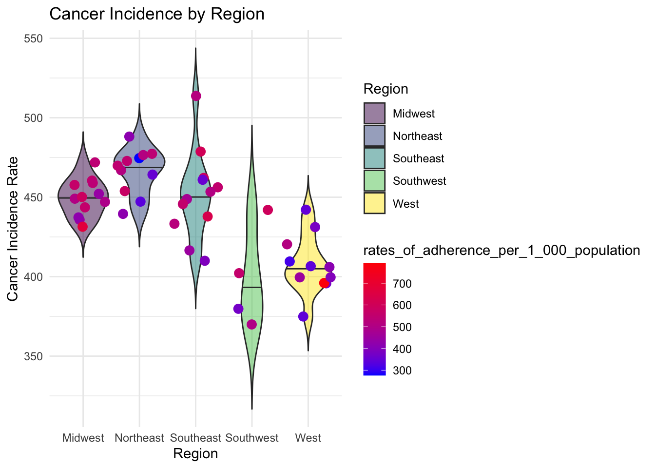
This plot compares cancer incidence and rates of adherence between regions. We can see that there is a much higher cancer incidence in the Northeast than there is in the West. There is also greater rates of adherence in the Southeast than there is in the West.
4e. Faceted Scatterplot with linear models and custom axis ticks
data %>% ggplot(aes(x=mo_Rate, y=rates_of_adherence_per_1_000_population)) + geom_point(aes(size = mo_Rate, color = Region),alpha = 0.5) + scale_size(range = c(.1, 7), name="Cancer Incidence") + geom_smooth(aes(color= Region,group=Region), method = "lm", se=T,alpha = 0.2)+ scale_y_continuous(breaks = seq(0,700, 200), limits = c(0,700)) + scale_color_viridis_d() + theme_minimal() + facet_wrap(~Region) + xlab("Mortality Rate") + ylab("Rates of Adherence (per 1000 people)") + ggtitle("Rates of Religous Adherence by Mortality Rate", subtitle = "Faceted by Region, Sized by Cancer Incidence, Linear Model Fitted by Region")## `geom_smooth()` using formula 'y ~ x'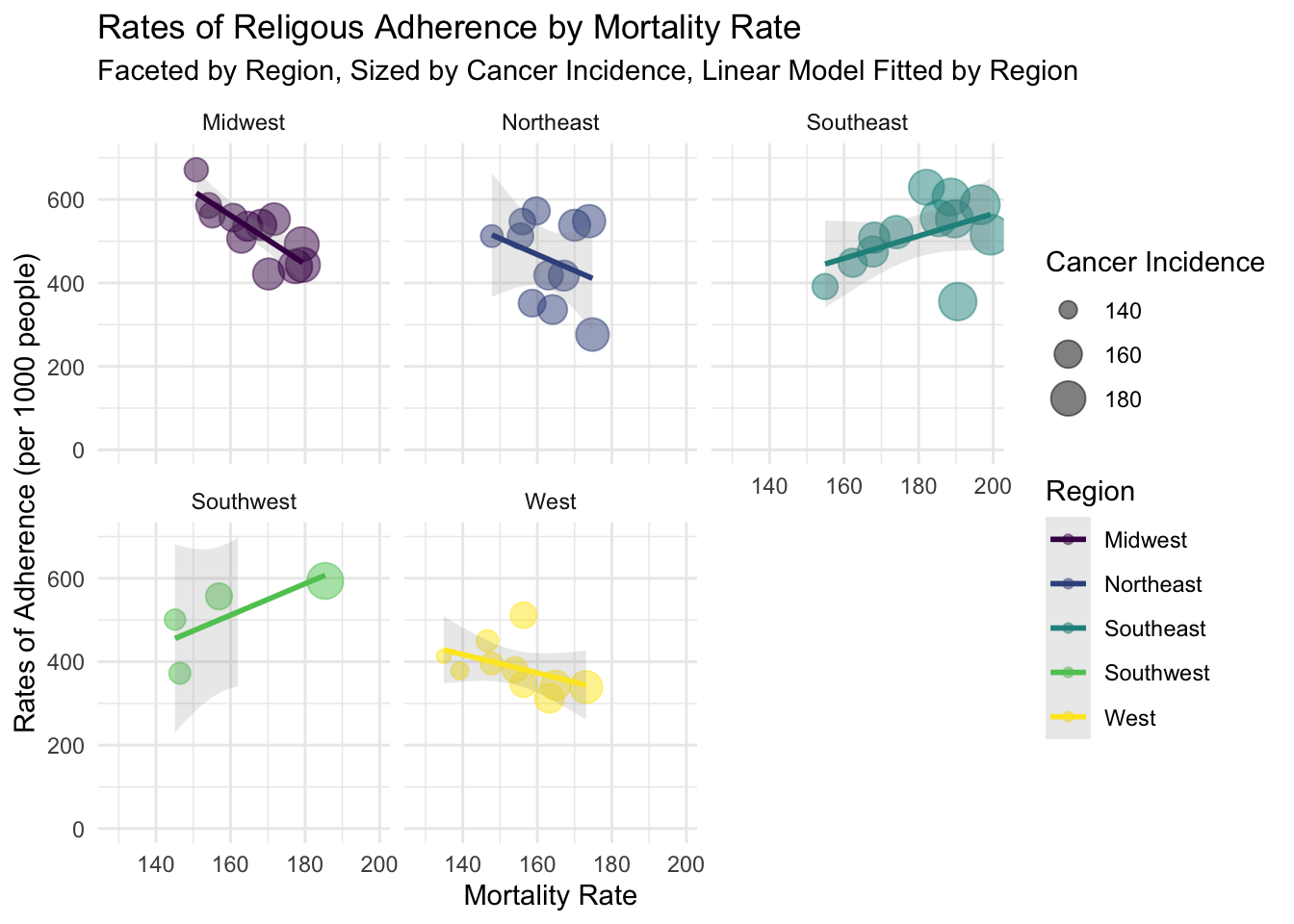
Facet scatterplot of cancer mortality rate and rate of religious adherence. They were grouped by Region, sized by cancer incidence rate. LM fitted to each group. This plot clarifies slight relationships between religiosity and cancer mortality rates. As expected, these relationships tend to be weak.
5. Dimensionality Reduction and Clustering
5a. Running PCA on Dataset
set.seed(421)
data_pca <-data %>% select_if(is.numeric) %>% scale %>% princomp
data_pca_df<- data.frame(PC1=data_pca$scores[, 1], PC2=data_pca$scores[, 2], PC3 = data_pca$scores[, 3]) %>%mutate(name = as.character(data$X1), Region = as.character(data$Region))

eigval <-  data_pca$sdev^2
varprop=round(eigval/sum(eigval), 2)
5a. Assess Variance Encompassed by Each Principal Component
ggplot() + geom_bar(aes(y=varprop, x=1:6), stat="identity") + xlab("") + geom_path(aes(y=varprop, x=1:6)) + geom_text(aes(x=1:6, y=varprop, label=round(varprop, 2)), vjust=1, col="white", size=5) +
  scale_y_continuous(breaks=seq(0, .6, .2), labels = scales::percent) +
  scale_x_continuous(breaks=1:10, limit = c(0.5,5.5)) + ggtitle("Variation Within Each Prinicpal Component") + ylab("Variation") + xlab("Principal Components") + theme_minimal()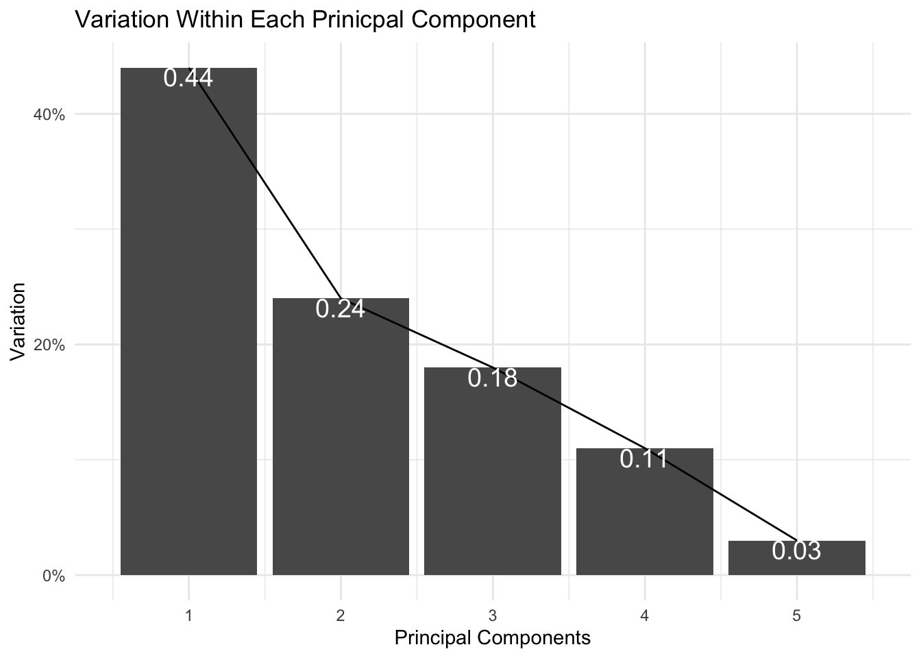
It appears that the first two principal components encompass ~68% of my data’s variation. I can capture up to ~ 86% variation if I visualize my data with the first three principal components.
5a. Visualizing Data By Region After PCA
fviz_pca_biplot(data_pca, habillage = data_pca_df$Region,label ="var") + theme_minimal()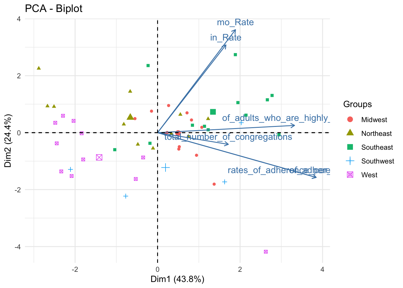
data_pca_df %>% plot_ly(x=~PC1, y=~PC2, z=~PC3, type="scatter3d", mode="markers", color = ~Region) %>% layout(scene = list(xaxis = list(title = 'PC1 (0.44)'), yaxis = list(title = 'PC2 (0.24)'), zaxis = list(title = 'PC3 (0.18)')))This is the first of three plot pairs. I am showing a biplot and 3D scatterplot of the scaled data (colored by Region).
From the biplot, we can ascertain that PC1 is positively related to every numeric variable in the dataset. PC2 is strongly positively associated with mortality and incidence rates but is somewhat negatively related to rates_of_adherence and total number of congregations.
I included the 3D scatterplot to help understand the data. While two principal components are sufficient to glean ~70% of the data’s variation, the addition of a third principal component yields about ~87% of the variation.
As for the distribution of the points by Region, some regions are very well defined in the feature space. The West and Southeast, for instance, are well separated from the other points; Midwest, Northeast, and Southwest are less well-defined.
5b. Validate Optimal K for Kmeans
max_k = 11
wss<-vector()
sil_width<-vector()
for(i in 2:max_k){
temp<- data %>% select_if(is.numeric) %>% scale %>% kmeans(i)
wss[i]<-temp$tot.withinss
sil <- silhouette(temp$cluster,dist(data))
sil_width[i]<-mean(sil[,3])
}

ggplot()+geom_point(aes(x=1:max_k,y=wss))+geom_path(aes(x=1:max_k,y=wss))+
  xlab("clusters")+scale_x_continuous(breaks=1:max_k) + xlim(2,max_k) + xlim(2,max_k) + xlab("K") + ylab("WSS") + theme_minimal() + ggtitle("WSS Silhouette Width by K")
## Scale for 'x' is already present. Adding another scale for 'x', which will
## replace the existing scale.
## Scale for 'x' is already present. Adding another scale for 'x', which will
## replace the existing scale.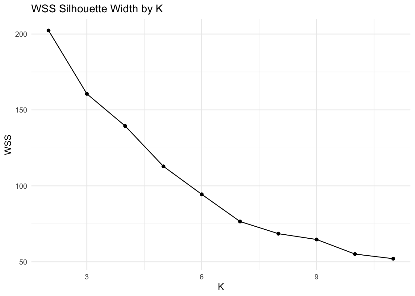
ggplot()+geom_line(aes(x=1:max_k,y=sil_width))+scale_x_continuous(name="k",breaks=1:max_k)+ xlim(2,max_k) + xlab("K") + ylab("Mean Silhouette Width") + theme_minimal() + ggtitle("Mean Silhouette Width by K")## Scale for 'x' is already present. Adding another scale for 'x', which will
## replace the existing scale.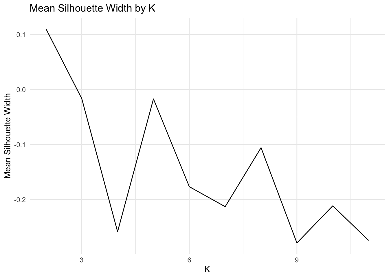
Based on the average silhouette width plot and the WSS plot, the optimal value of K is 2. This value of K corresponds to an average silhouette width of ~0.11 and a WSS of ~200.
5b. Assess Cluster “Goodness” with (Mesa-themed) Silhouette Plot
km <- data %>% select_if(is.numeric) %>%scale %>% kmeans(2)
ss <- silhouette(km$cluster, dist(data%>% select_if(is.numeric)))
plot(ss,col = c('#E53D57', "#E68E0C"), border = NA, main = "Silhouette Plot of Kmeans Clusters")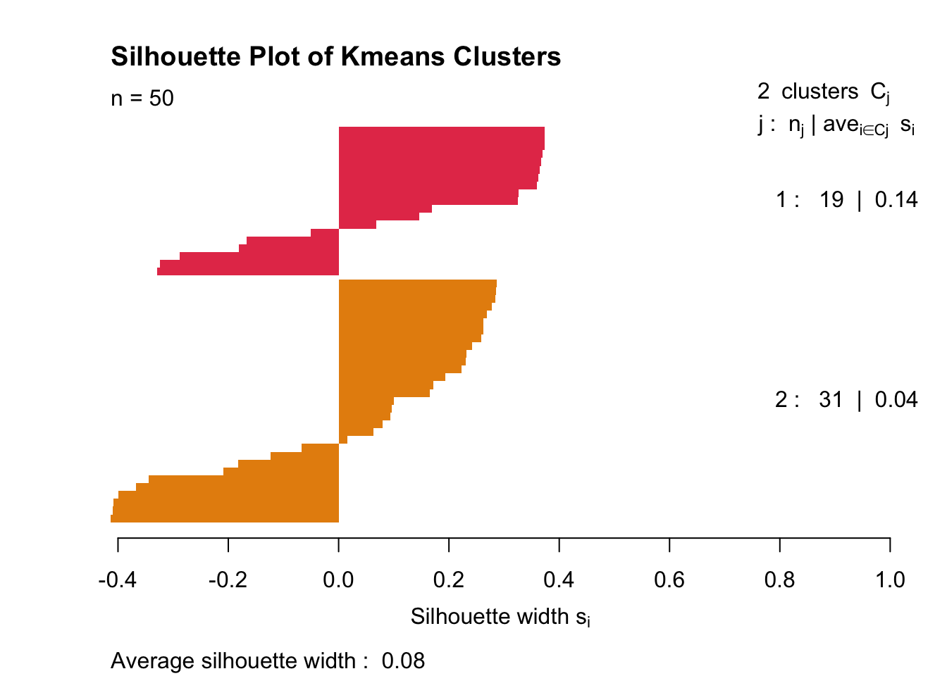
As expected, the clusters look absolutely wretched. Average silhouette width is 0.11.
5b. Visualizing Kmeans Clusters In Feature Space (with Principal Components)
data_pca_df_km <- data_pca_df %>% mutate(cluster=as.factor(km$cluster))
fviz_pca_biplot(data_pca, habillage = data_pca_df_km$cluster,label ="var") + theme_minimal()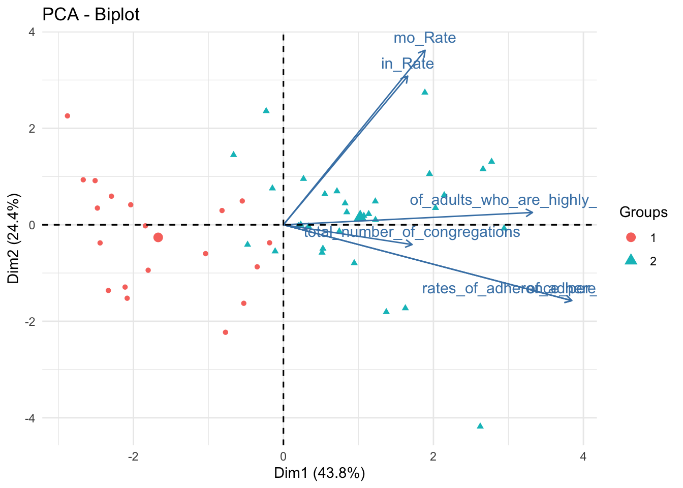
data_pca_df_km %>% plot_ly(x=~PC1, y=~PC2, z=~PC3, type="scatter3d", mode="markers", color = ~cluster) %>% layout(scene = list(xaxis = list(title = 'PC1 (0.44)'), yaxis = list(title = 'PC2 (0.24)'), zaxis = list(title = 'PC3 (0.18)')))These are the same plots as previously shown; however, marker colors were changed to represent clusters defined by Kmeans. Clusters are somewhat prominent; Cluster 1 is high on PC1, Cluster 2 is low on PC1.
5c. Validate Optimal K for PAM
max_k = 10
pam_dat<-data %>% select_if(is.numeric) %>% scale
sil_width<-vector()
for(i in 2:max_k){
  pam_fit <- pam(pam_dat, k = i)
  sil_width[i] <- pam_fit$silinfo$avg.width
}
ggplot()+geom_line(aes(x=1:max_k,y=sil_width))+scale_x_continuous(name="k",breaks=1:max_k) + xlim(2,max_k) + xlab("K") + ylab("Mean Silhouette Width") + theme_minimal() + ggtitle("Mean Silhouette Width by K")
## Scale for 'x' is already present. Adding another scale for 'x', which will
## replace the existing scale.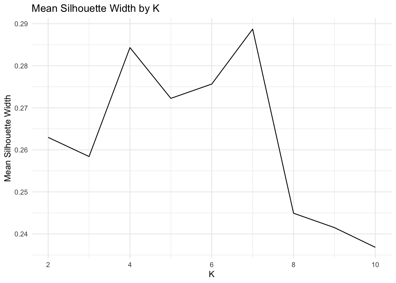
Even though k=6 has a higher silhouette score than k=4, I choose to set k=4. This is one of those interpretability-tightness tradeoffs.
5c. Assess PAM Cluster “Goodness” with another (Mesa-themed) Silhouette Plot
gower1 <-daisy(data %>% select(-X1) %>% mutate_if(is.character,as.factor) %>% select_if(is.numeric) %>% scale,metric="gower")
pam_fit <- pam(gower1,k = 4,diss =T)

plot(silhouette(pam_fit$clustering,gower1), col = c('#E53D57',"#D9563A", "#E68E0C", "#89669D"), border = NA,main ="Silhouette Plot of PAM Clusters")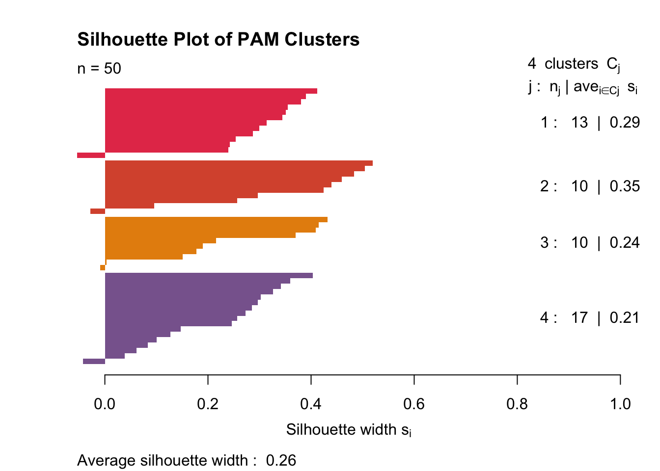
It’s clear that with PAM, my data clusters a little more cleanly. The clusters still aren’t great (as seen by the very small 0.26 mean silhouette width). Cluster two is fairly tight, and cluster four is somewhat diffuse. Each cluster has one or two samples that don’t belong.
5c. Visualizing Kmeans Clusters In Feature Space (with Principal Components)
data_pca_df_pam <- data_pca_df %>% mutate(cluster=as.factor(pam_fit$clustering))
fviz_pca_biplot(data_pca, habillage = data_pca_df_pam$cluster, label ="var")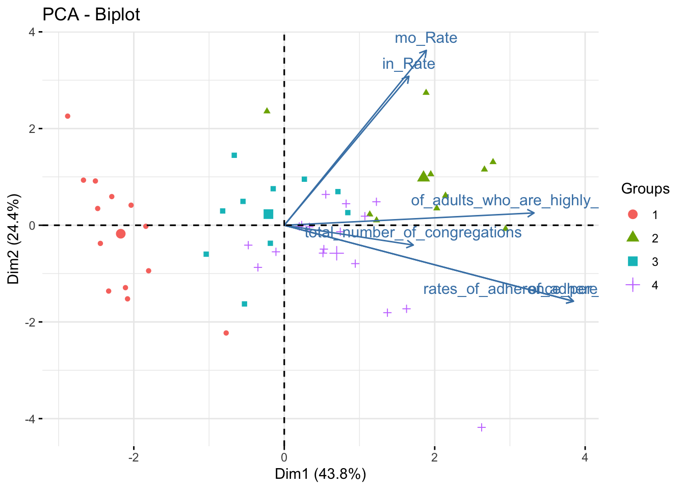
data_pca_df_pam %>% plot_ly(x=~PC1, y=~PC2, z=~PC3, type="scatter3d", mode="markers", color = ~cluster) %>% layout(scene = list(xaxis = list(title = 'PC1 (0.44)'), yaxis = list(title = 'PC2 (0.24)'), zaxis = list(title = 'PC3 (0.18)')))These principal components are the same as in the previous plot. The only element changed is the marker color, which now represents clusters determined via PAM.
Cluster 1 is very low on PC1 and nearly 0 on PC2. Cluster 2 is very high on PC1 and almost 0 on PC2. It is impossible to differentiate clusters 3 and 4 using only two principal components. These each score near 0 on PC1 and PC2, but Cluster 3 scores slightly positive on PC3 while Cluster 4 scores slightly negative on PC3.
Ryan Bailey
Medical Student, Bioinformatician, and Photographer in San Antonio, Texas.
My interests include unsupervised learning, oncology, software engineering. matter.